New R package for STARD diagrams
Building on the amazing consort R package, I’ve generated a new package to generate STARD diagrams. This makes is very simple to generate these essential diagrams for diagnostic reporting studies.

The stard github repository provides an example based on an existing study we published in 2022.
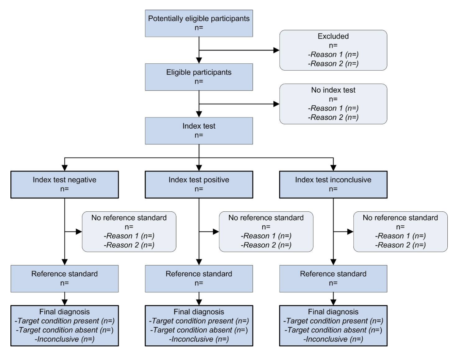
Below, I’m showing example code for a new diagram based on the prototypical STARD diagram.
Example dataframe
Let’s assume we have a total population of 4000 with various excluded, inconclusive, and other results.
library(stard)
set.seed(300)
df <- data.frame(total_population = 1:4000,
                 excluded = sample(c("Reason 1", "Reason 2", NA), 4000, replace = T, prob = c(0.02, 0.05, 0.93)))

df$eligible <- ifelse(is.na(df$excluded),
                      sample(c("Reason 1", "Reason 2", NA), sum(is.na(df$excluded)), replace = T, prob = c(0.01, 0.03, 0.96)),
                      NA)
df$eligible_text <- ifelse(is.na(df$excluded), 'Eligible',
                           NA)


df$index <- ifelse(is.na(df$eligible),
                   sample(c("Index test negative", "Index test positive", "Index test inconclusive"),
                          size = sum(is.na(df$eligible)),
                          replace = T,
                          prob = c(0.6, 0.35, 0.05)),
                   NA)

df$ref_histology <- ifelse(!is.na(df$index),
                   sample(c("Reason 1", "Reason 2", NA),
                          size = sum(!is.na(df$index)),
                          replace = T,
                          prob = c(0.03, 0.005, 0.965)),
                   NA)

df$type <- ifelse(is.na(df$ref_histology),
                  sample(c("Target condition present",
                           "Target condition absent",
                           "Inconclusive"),
                         size = sum(is.na(df$ref_histology)),
                         replace = T,
                         prob = c(0.05, 0.91, 0.04)),
                  NA)
Plotting the consort diagram
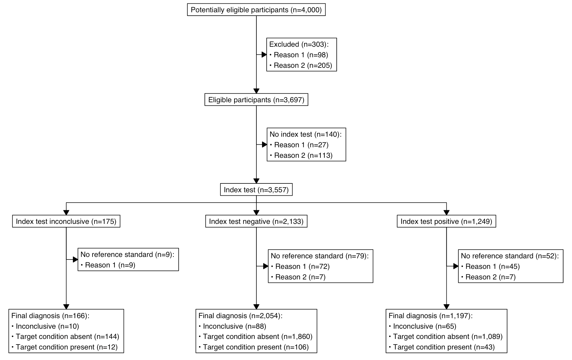
Ok, now we have an example data frame. How do we convert it to a diagram? Simple!
out <- stard_plot(df,
           order = c(total_population = "Potentially eligible participants",
                     excluded = 'Excluded',
                     eligible_text = 'Eligible participants',
                     eligible = 'No index test',
                     index = 'Index test',
                     ref_histology = 'No reference standard',
                     type = 'Final diagnosis'),
           side_box = c("excluded",
                        'eligible',
                        'ref_histology'),
           index_test = "index",
           type = "type")

plot(out)

As someone who has had to make these diagrams manually many times this was really a much needed addition to things that can be done programmatically.
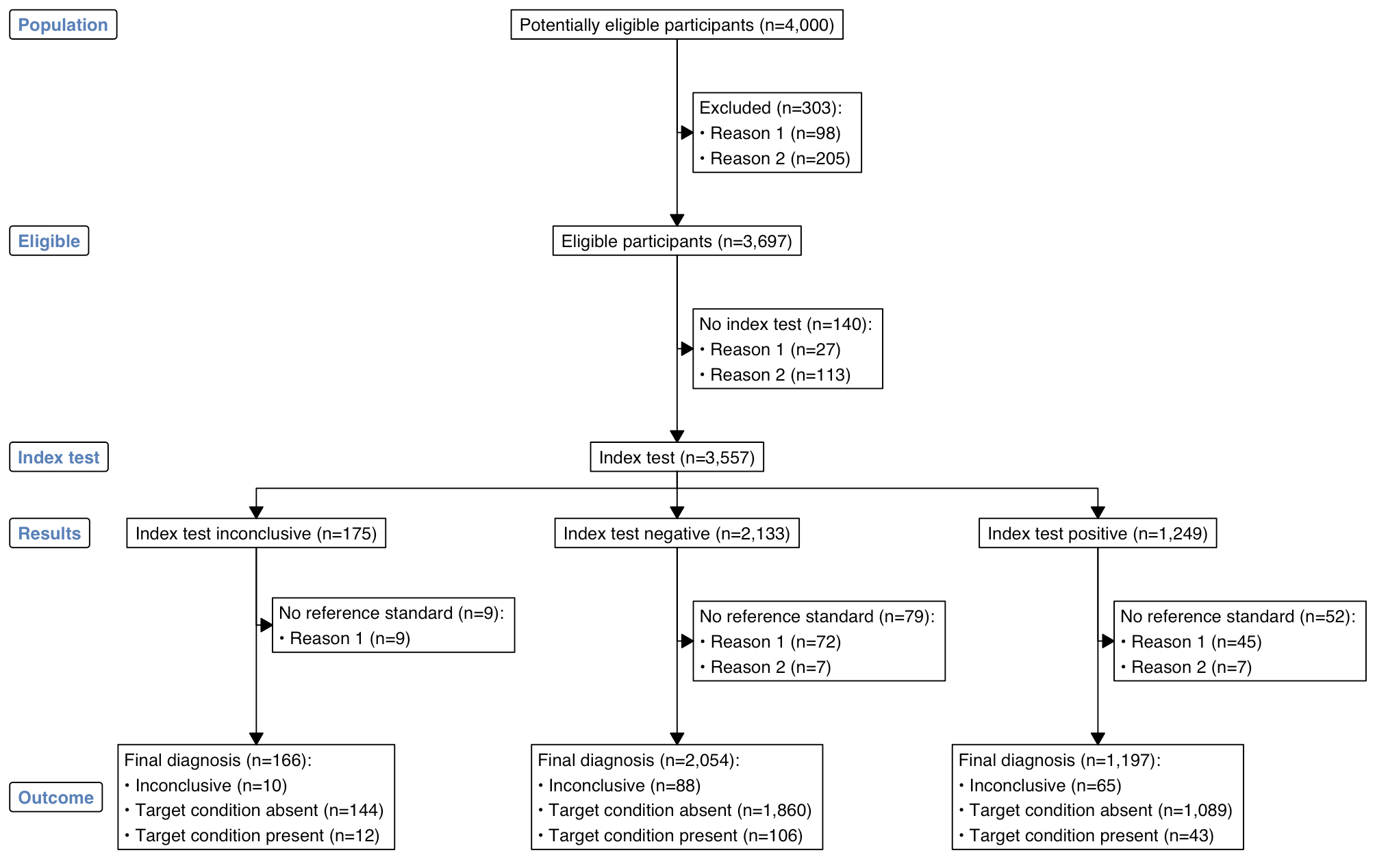
We can also add labels, if we want:
out <- stard_plot(df,
                  order = c(total_population = "Potentially eligible participants",
                            excluded = 'Excluded',
                            eligible_text = 'Eligible participants',
                            eligible = 'No index test',
                            index = 'Index test',
                            ref_histology = 'No reference standard',
                            type = 'Final diagnosis'),
                  side_box = c("excluded",
                               'eligible',
                               'ref_histology'),
                  index_test = "index",
                  type = "type",
                  labels = c("1" = "Population",
                             "2" = "Eligible",
                             "3" = "Index test",
                             "4" = "Results",
                             "5" = "Outcome"))

plot(out)

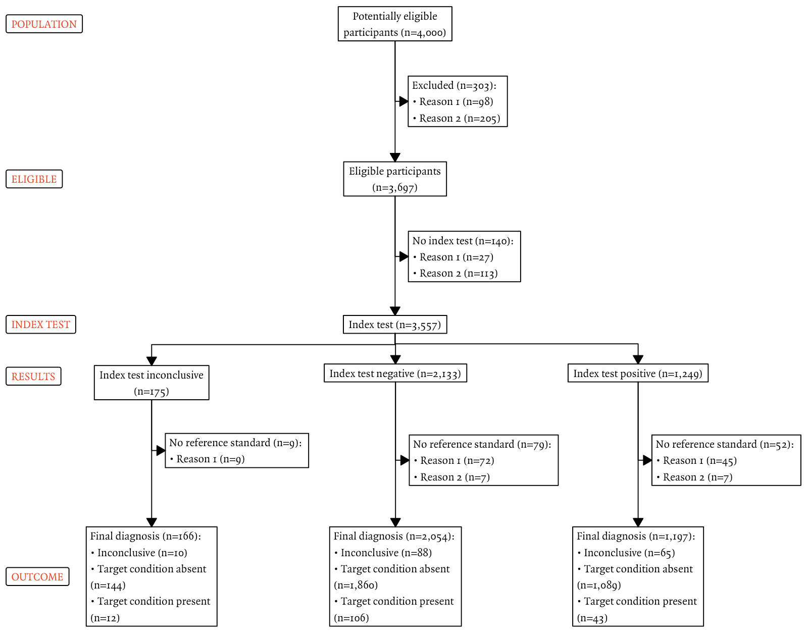
Lastly, the colours for labels and the font can be customised:
out <- stard_plot(df,
                  order = c(total_population = "Potentially eligible participants",
                            excluded = 'Excluded',
                            eligible_text = 'Eligible participants',
                            eligible = 'No index test',
                            index = 'Index test',
                            ref_histology = 'No reference standard',
                            type = 'Final diagnosis'),
                  side_box = c("excluded",
                               'eligible',
                               'ref_histology'),
                  index_test = "index",
                  type = "type",
                  labels = c("1" = toupper("Population"),
                             "2" = toupper("Eligible"),
                             "3" = toupper("Index test"),
                             "4" = toupper("Results"),
                             "5" = toupper("Outcome")),
                  col = "#fc3b0f",
                  fill = "white",
                  fontfam = 'Quadraat',
                  text_width = 30,
                  cex = 0.7)

plot(out)

Future iterations could also include bolding of labels.
Exporting the plot
The plot can be exported by printing to PDF or png:
png("stard_diagram.png", width = 29,
    height = 21, res = 300, units = "cm", type = "cairo")
plot(out)
dev.off()

cairo_pdf("stard_diagram.pdf", width = 10,
    height = 7)
plot(out)